Logo and claim
There are three versions of the KWC logo
- Without claim
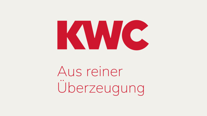
- With a two-line claim
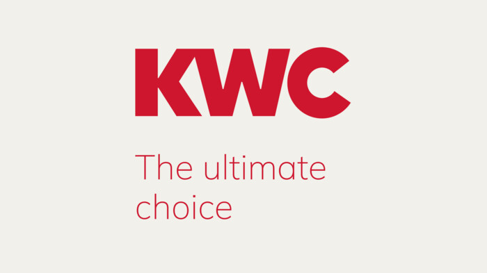
- With a single-line claim
Rules for how and when to use each of these three versions have been established, and these rules must be complied with.
The two-line claim is in the font style ExtraLight, the single-line claim in the font style Light, so that readability is guaranteed especially in small image sizes.

Logo without claim: 10.5 mm (%)*
Logo with two-line claim: 20 mm (%)*
Logo with single-line claim: 31.5 mm (%)*
The logo variant with a single-line claim can only be used up to the DIN A4 format. For smaller versions, the logo without a claim or with a two-line claim must be chosen so that the readability and feasibility of the claim is guaranteed.
* The millimetre specifications also apply as percentages.
Logo protected zone
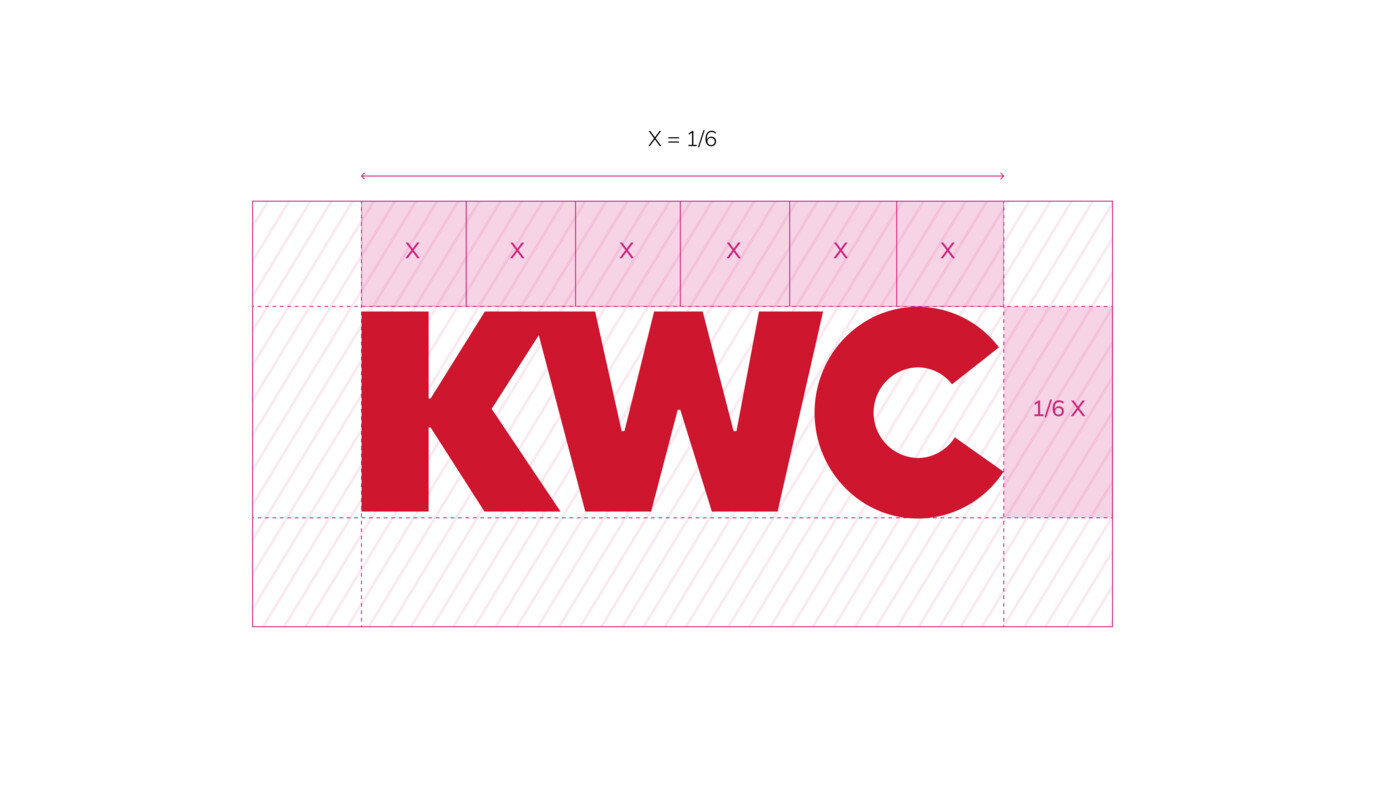
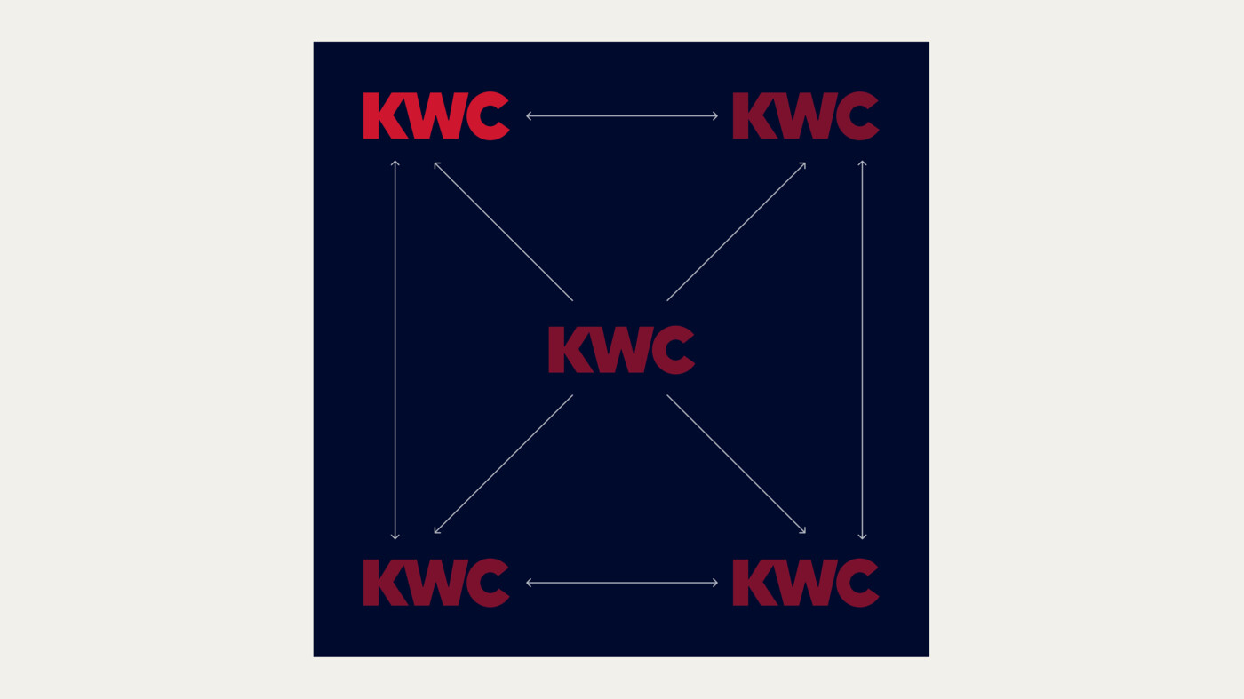
The protected zone of the KWC logo is 1/6 of the logo width on all sides; this subdivision is marked X. No graphic or text elements may appear within this zone.
This protected zone must always be guaranteed. The reference values for the logo image sizes are explained under Logo Size.
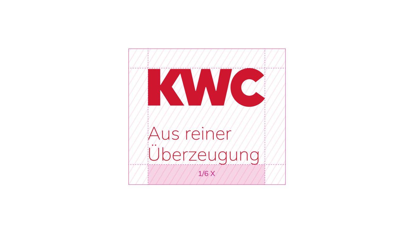
Logo versions with claim are subject to the same protected zone.
Logo size
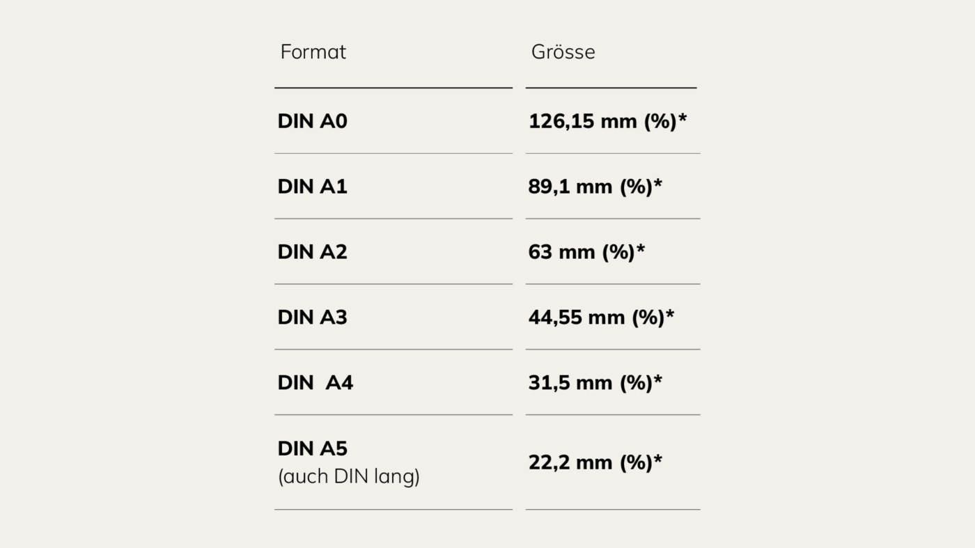
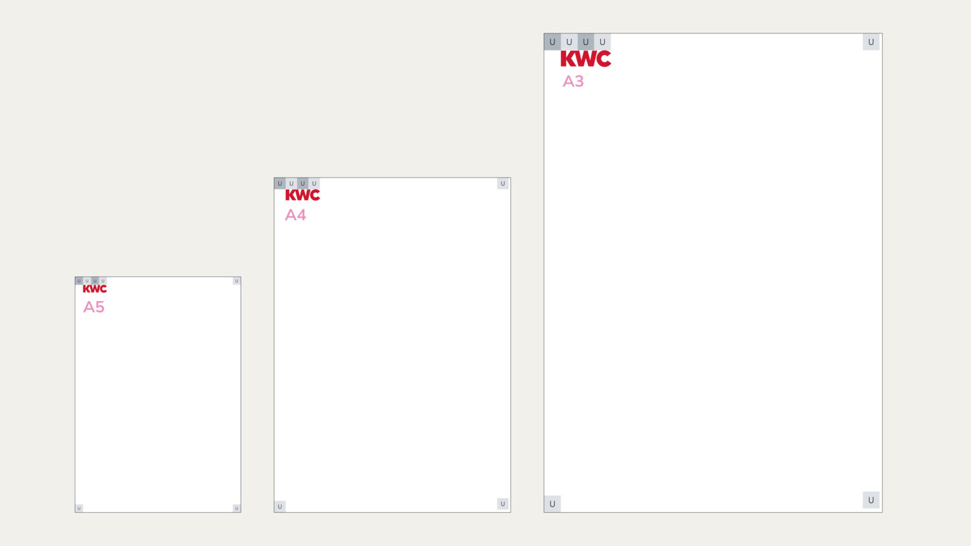
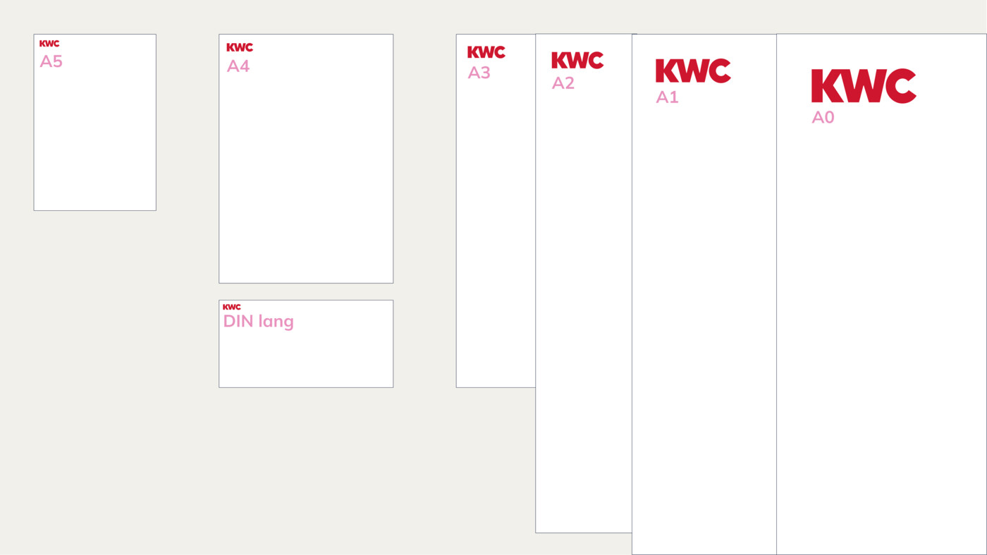
Reference values for the image sizes of all common formats are defined in the table shown.
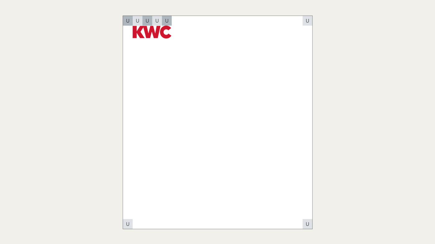
For the common DIN formats, the width of the logo is always 3 units. This unit of measurement is derived from the format size, see Basic Elements Design Principle.
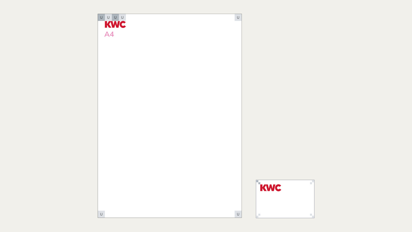
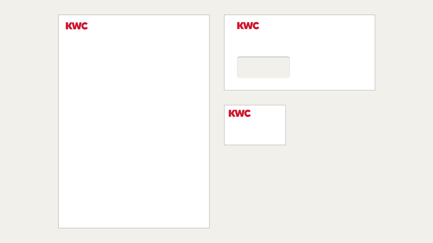
In the case of DIN format deviations, in order to avoid inconsistency and to create more standardisation, the logo size of the nearest DIN format is selected in relation to the relevant format size. The same logo size should be chosen for media that are considered connected or as one (e.g. letterhead and business card).
For extreme formats, the requirements of the medium must be taken into account, for example, whether the medium is viewed from a distance or whether it is viewed in connection with other media; the logo is adapted accordingly.
The same logo size is chosen for letterhead and business card, as they are considered connected or as one.
Logo colour scheme
The KWC logo colour scheme is used according to the following hierarchy:
01. General use
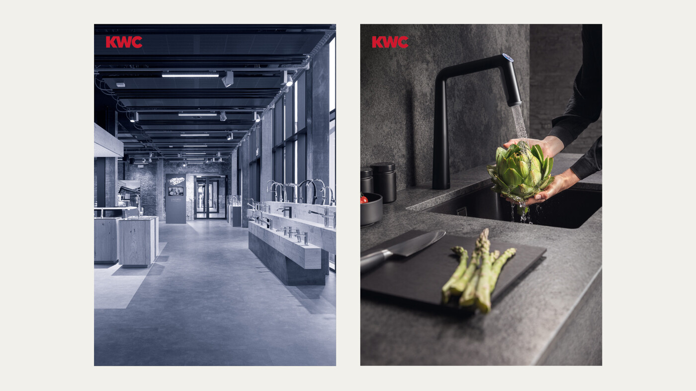
Primarily, the KWC logo is used in KWC Red, against the background KWC Deep Blue, White or an image background. On images, it is used in KWC Red or negative, depending on the background.
02. Relative to the brand
The logo is always negative on the colour KWC Red. This combination is used in connection with the brand.
03. 1C design
The logo is also available in black for 1C designs, for example, for less cost-intensive designs.
Don’ts
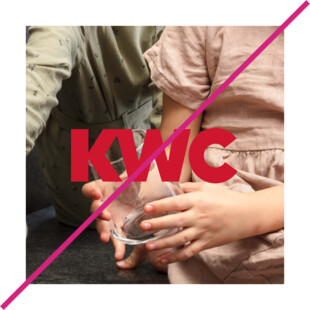
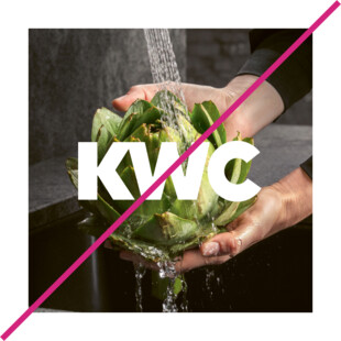
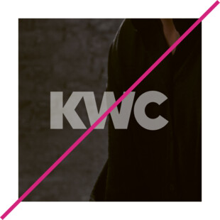
Logo positioning
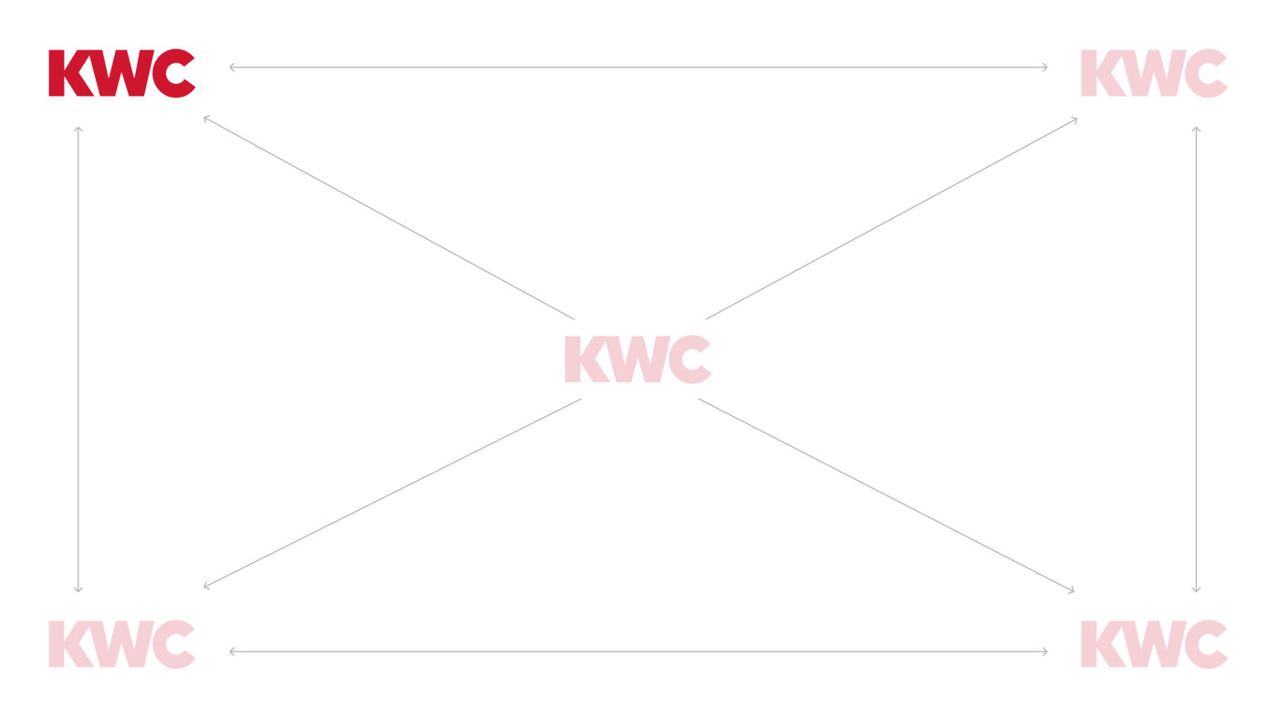
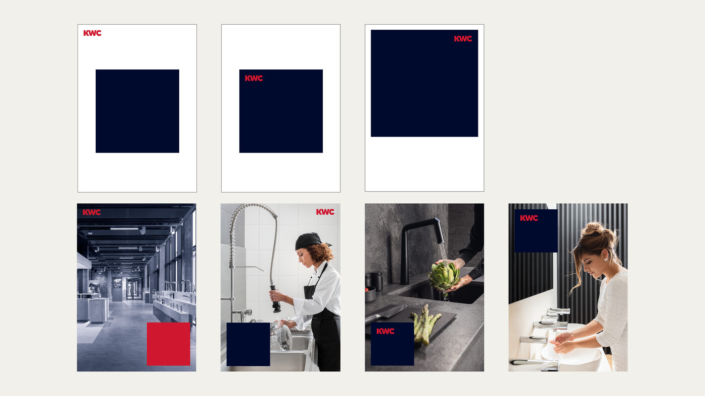
The logo is so bold and strong that it can be placed freely in the layout. Any medium, analogue or digital, can be served with this variation.
Ideally, the logo should always be placed in a corner of the layout or the brand field. For media of a connected group, the logo has a consistent place, for example, for advertisements, supplements and brochures, see Basic Elements Design Examples.
Always note the protected zone of the logo and the protected space of the layout, which is defined by the units.
Depending on the application, the logo can also be used prominently (e.g. in the centre).
The logo can be positioned outside as well as inside the brand field according to the given rules.
This can be very helpful when working with busy backgrounds.
The logo has a consistent place when it comes to media that belong together. These are determined by KWC Group Marketing.
Logo with claim – variations
The combination of logo and claim as a unit is available in two versions and each in German and English. In exceptional cases, it is also available in Italian and French. The German claim is used in German-speaking countries, while the English claim is used internationally:
V1
The claim is created as EPS and is mirrored in the same size as the logo. It is either below the logo or to the right of it.
V2
The claim is as wide as the logo. In this version, it can be placed only below the logo. In this case, the logo and the claim are one single file.
No text in Red may be added to the logo. Only Group Marketing can approve exceptions.
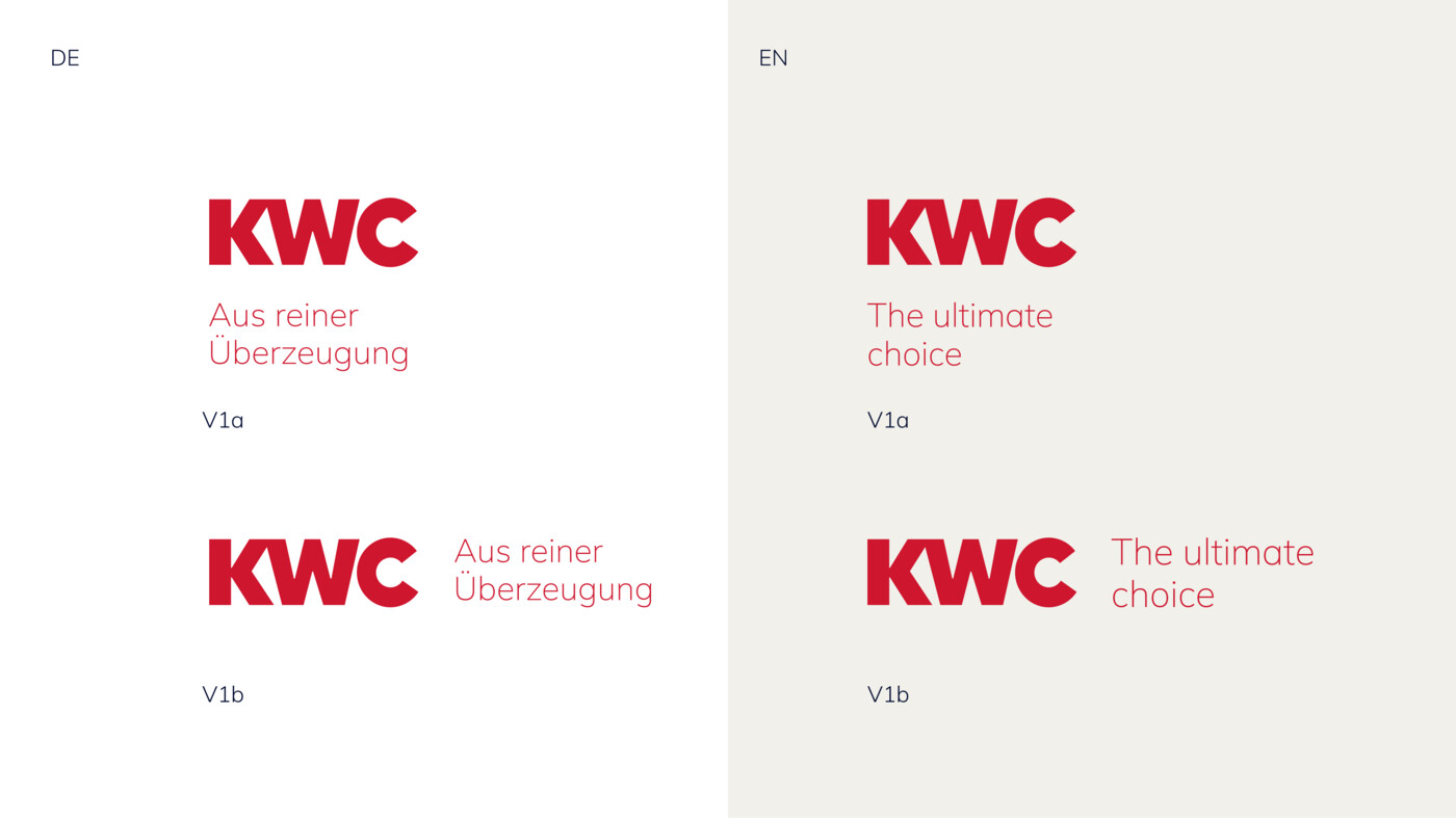
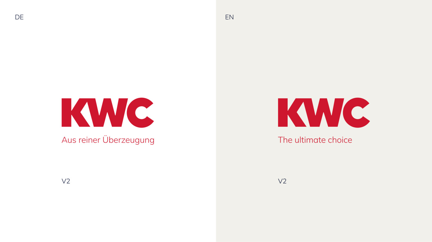
The claim in Italian and French is only used in Switzerland and France due to legal requirements.
The protected space of the logo is respected regarding the distance from the claim to the logo. The construction rules apply to both language versions.
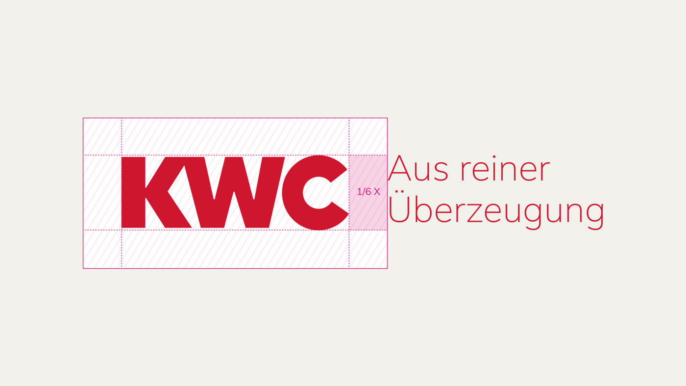
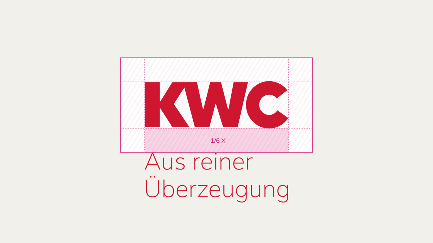
On a White background, the claim is always the same colour as the logo. Always negative when placed on KWC Red and KWC Deep Blue. These rules apply to all versions.
The claim is placed below or to the right of the logo, with a fixed distance depending on the application size.
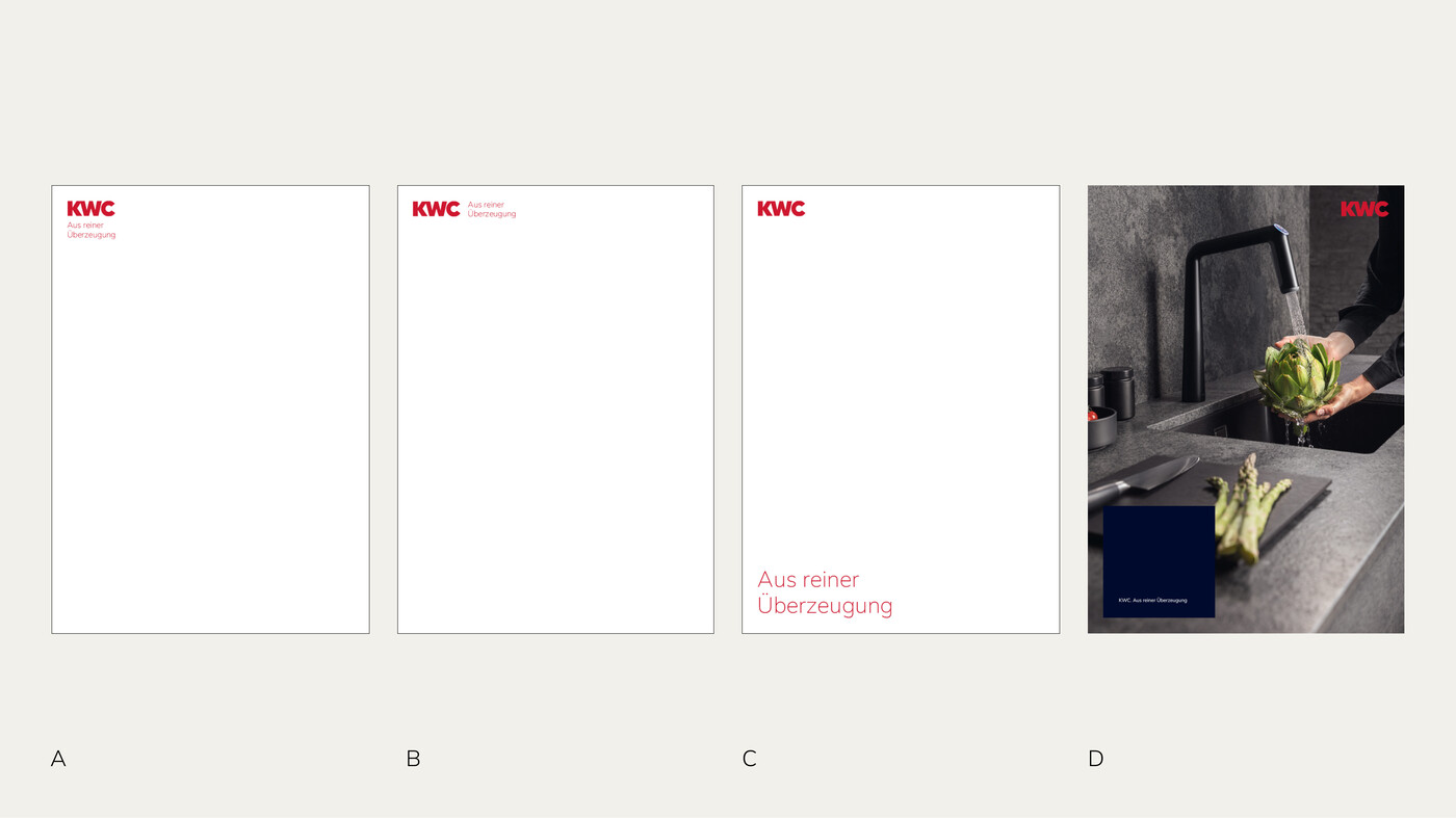
Logo and claim as a unit can be decoupled. However, the claim should always be associated with the KWC logo on a page. If the claim is detached from the logo, it may only be placed to the right of the logo or below it, so that the reading flow of “KWC. Out of pure conviction” is guaranteed.
The size of the claim is adjusted to the size of the logo if it is positioned directly next to the KWC logo. If it is detached but aligned with the logo in the layout, its image size can be flexible.
If the claim appears in the brand field in text form, “KWC. Out of pure conviction” is used to guarantee the reading flow.
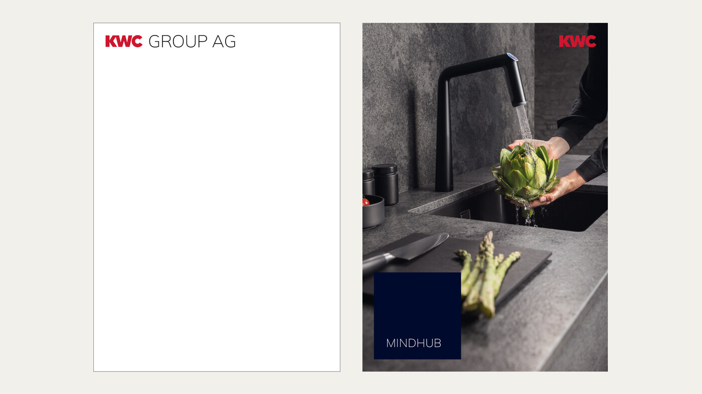
KWC theme area additions
- KWC GROUP AG
- KWC MINDHUB
Note:
The logo may be designed with a theme area addition only in coordination with KWC Group Marketing. The theme area addition is placed in Black, to the right of the logo or in the brand field on KWC Deep Blue in White; also see Logo with Claim – Colour Scheme.
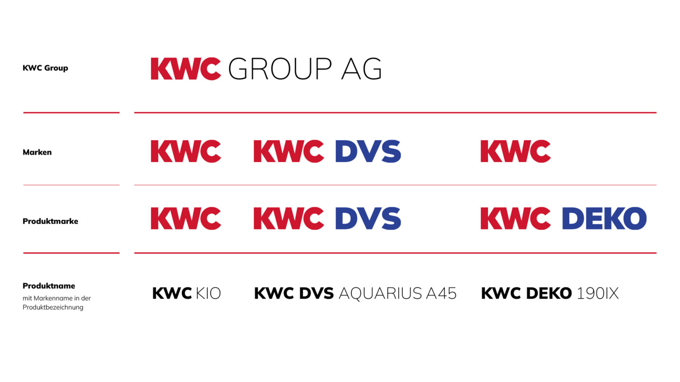
The old logos of DVS and the DEKO product brand are no longer used on their own.
The DVS brand and the DEKO product brand are given a new logo for the transitional period.
Brand architecture
Download
Our trademarks are protected and may only be used by persons and companies who are contractually authorised to do so. We provide our logos in different versions so that they can be used in the best possible way across all media. These official templates may not be altered.